High Converting Landing Page - Tips That Improve Visitor Actions

A high converting landing page is all about nudging visitors to take the next step—turning curiosity into leads or loyal customers by encouraging immediate action. Its main goal is to back up core business objectives like boosting sales or snagging sign-ups. It also fields inquiries while cutting out the noise and guiding visitors to a clear and compelling offer they just cannot miss.
Conversion-focused design is about way more than just looking sharp. It gently steers visitor behavior through a clear structure and strong hierarchy with persuasive messaging and above all ease of use. Every detail is crafted to smooth the path toward the conversion goal and cut down on hurdles.
Crafting a Clear and Absolutely Engaging Value Proposition
Your landing page’s value proposition should clearly and snappily spell out the unique benefit visitors can expect.
- Make sure your value proposition is crystal clear and steers clear of any confusing jargon that might make eyes glaze over.
- Tailor your message so it hits home with the specific needs and challenges your target audience is actually facing.
- Highlight what makes your offer stand out from the crowd, and why it’s genuinely a smarter pick than the rest.
- Sprinkle in a little urgency or scarcity—think limited-time perks—to gently nudge individuals towards taking action sooner rather than later.
How to Make Headlines and Subheadlines Pull Their Weight (and Then Some)
Headlines and subheadlines are the very first things visitors lay eyes on, so they’ve got to catch attention fast and spotlight the main perks.
Use specific numbers or hard data to instantly boost credibility and grab attention like "Increase Your Sales by 30% in 2 Weeks" which really speaks to results.
Kick things off with a direct question that hits home on the visitor’s problem because it’s a great way to pull them right into the conversation.
Make sure to clearly highlight the solution or main benefit so readers can quickly see the value without any beating around the bush.
Don’t be shy about experimenting with emotional triggers like fear or curiosity since these nudges can turn a so-so headline into something memorable.
Keep those headlines short and snappy—they should be easy on the eyes and quick to scan because nobody has time to sift through clutter or fluff.
Making the Most of Visual Elements and Building Trust That Lasts
Visual content quickly grabs attention and really helps back up your message in ways that keep people genuinely engaged. When you pair it with trust signals like customer testimonials or security badges, these visuals can do wonders for boosting credibility and easing any lingering doubts.
- Choose crisp high-quality images that truly connect with your product or service—think of them as the first handshake with your audience.
- Toss in some explainer videos to quickly spotlight the main benefits and ease any common concerns.
- Flaunt trust badges from payment processors, security certifications or awards to quietly shout out your credibility without sounding boastful.
- Highlight genuine customer testimonials with names and photos because nothing beats real people sharing honest experiences.
- Use authentic user photos or case study visuals to add a personal touch that makes your offer feel more trustworthy and relatable.
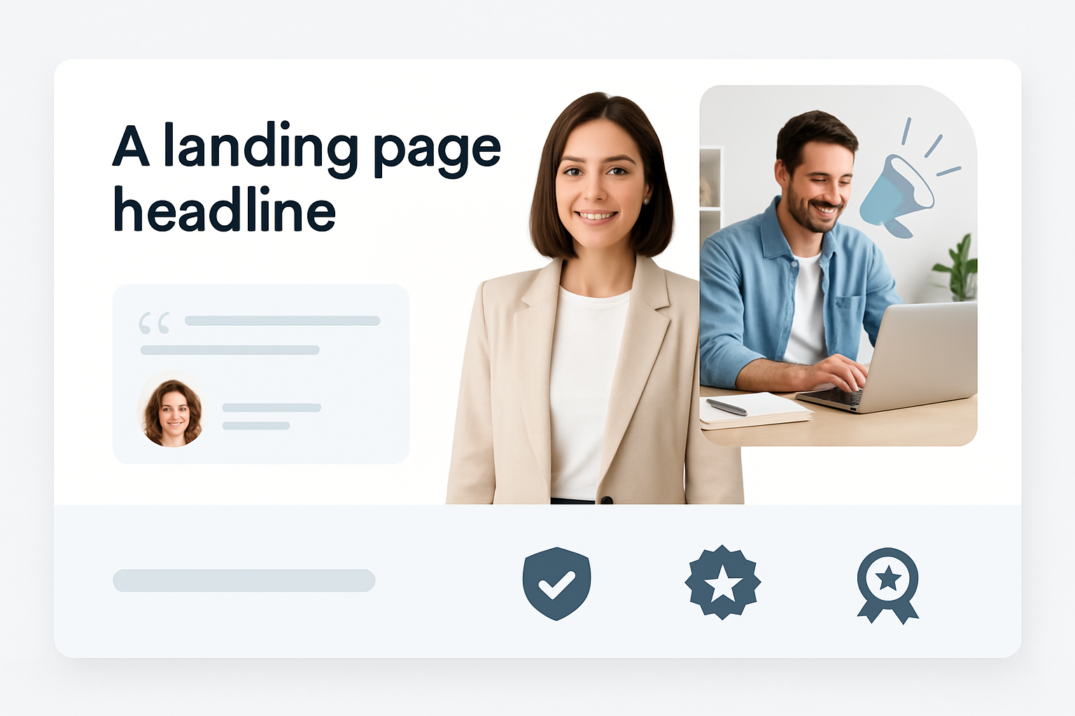
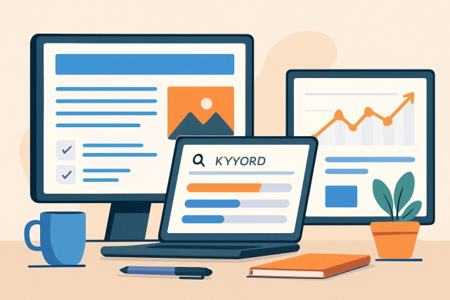
Example of a high converting landing page featuring strategic placement of visuals and trust signals.
Making Call-to-Actions (CTAs) More Effective to Boost Conversions Because a Nudge Goes a Long Way
Your CTA buttons are more than just pretty pixels—they're the unsung heroes driving your conversions. When you use clear punchy action verbs with a focused message and a design that truly stands out, you will often see a noticeable jump in click-through rates and overall results.
Use strong action-packed verbs like "Get," "Download," or "Start" to give users clear directions on what to do next with no guesswork needed.
Sprinkle in a bit of urgency with phrases like "Now," "Limited Offer" or "Today Only" to nudge people into acting sooner.
Pop your CTAs in all the right places and don’t be shy about repeating them especially right above the fold and close to your main messages.
Pick contrasting colors for your CTA buttons so they pop and grab attention without playing hide and seek.
Keep mixing things up by testing different phrases and designs. A little trial and error goes a long way toward steadily boosting conversion rates over time.
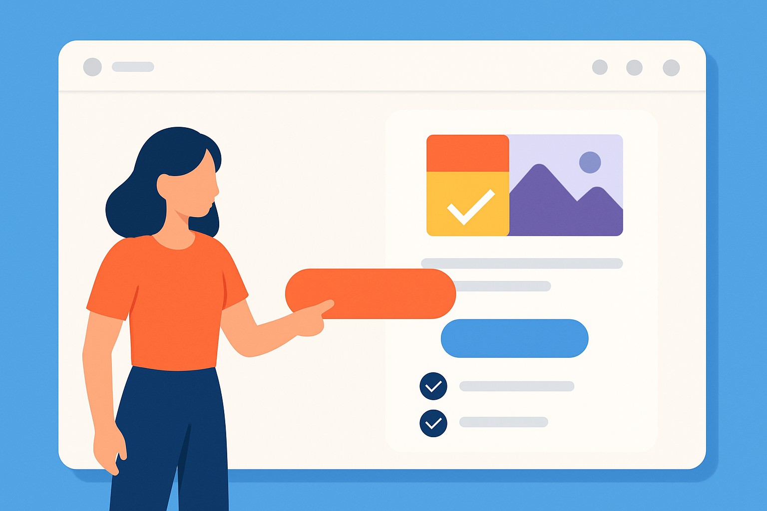
Making High Converting Landing Page Layouts Clear and Well-Organized—Because First Impressions Matter
A clean, simple layout really works wonders to keep visitors from feeling swamped and smoothly guides their attention where it counts. When content flows in a sensible order and there’s a generous sprinkle of whitespace, users can take it all in much more easily.
- Place all essential messages and calls to action right up front to catch attention without fuss.
- Trim down extra navigation menus or links that could pull visitors away before they convert.
- Don’t be shy with whitespace; letting things breathe amps up readability and makes key bits pop.
- Lay out a clear visual hierarchy by playing with font size, color, and alignment so the viewer’s eye glides naturally.
- Ensure the design slides smoothly across all devices with extra TLC for those on mobile because that’s where most people hang out these days.
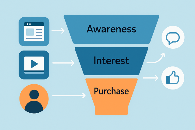
Using Psychological Triggers to Boost Visitor Engagement (and Keep Them Coming Back for More)
Understanding human psychology really helps landing pages strike a chord with visitors on a deeper level. When you sprinkle in triggers like scarcity and social proof, authority, reciprocity or commitment people tend to jump into action faster. They usually feel more confident about the choices they are making.
Show limited availability or add countdown timers to nudge people toward taking action by creating a strong sense of urgency. Sometimes a little tick-tock goes a long way.
Flaunt customer numbers or usage stats—it’s a tried and true way to spotlight popularity and build trust without sounding like you’re bragging.
Pop in expert recommendations or recognizable brand logos to back up your claims with solid authority and credibility. People love social proof.
Offer small freebies or handy content right off the bat to spark a warm feeling of reciprocity. Everyone appreciates a thoughtful gesture.
Make commitment easy by offering risk-free trials, easy opt-out options, or a clear step-by-step process that even your busiest customer can follow without stress.
Sharpening Speed and Tweaking Technical Setup to Boost User Experience
Technical performance is a big player when it comes to conversions. Fast load times and rock-solid mobile responsiveness work with smooth interactions to keep visitors hooked and prevent them from bouncing off too quickly
- Compress images with care to trim down load times while preserving quality.
- Choose fast and reliable hosting providers because they are the unsung heroes that keep server delays from driving visitors away.
- Remove any third-party scripts that might slow down your page rendering, as less clutter means a smoother ride.
- Enable browser caching and use Content Delivery Networks (CDNs) to speed up repeat visits. This is like giving your returning visitors a VIP fast lane.
- Build fully responsive designs using the latest frameworks to ensure a seamless, buttery-smooth experience across all mobile devices regardless of screen size.
How A/B Testing Can Help You Keep Tweaking and Improving Your Landing Page
Continually improving with A/B testing is like having a trusty compass for creating a high converting landing page that truly clicks with your audience. By experimenting with different headlines, CTAs, visuals and layouts, you gather golden nuggets of data that boost conversions and fine-tune your overall game plan.
Keep each test focused on just one variable at a time like tweaking a headline or changing the color of a CTA button. It’s the best way to clearly spot what’s actually making a difference.
Let your tests run long enough to collect data that truly holds water. That means it’s statistically meaningful and not just random noise.
Lean on handy tools like Moz Pro or Mangools to keep an eye on SEO and traffic metrics alongside your conversion rates. They’re like your test’s best friends.
Take a good hard look at the results to really understand what your visitors are up to and what floats their boat.
Once you’ve spotted the winner, roll out that version without delay and then get your gears turning for the next set of tests to keep the momentum going.
Further Reading

Unlock Digital Marketing Success with Moz
Struggling to optimize your online presence? Moz is the ultimate Internet Marketing solution, empowering businesses with powerful SEO tools, insightful analytics, and expert guidance. Elevate your digital strategies and outshine the competition.
- Boost organic traffic with data-driven SEO tactics
- Enhance content marketing with expert recommendations
- Gain a competitive edge with comprehensive link analysis